Brief For A Busier Shelf
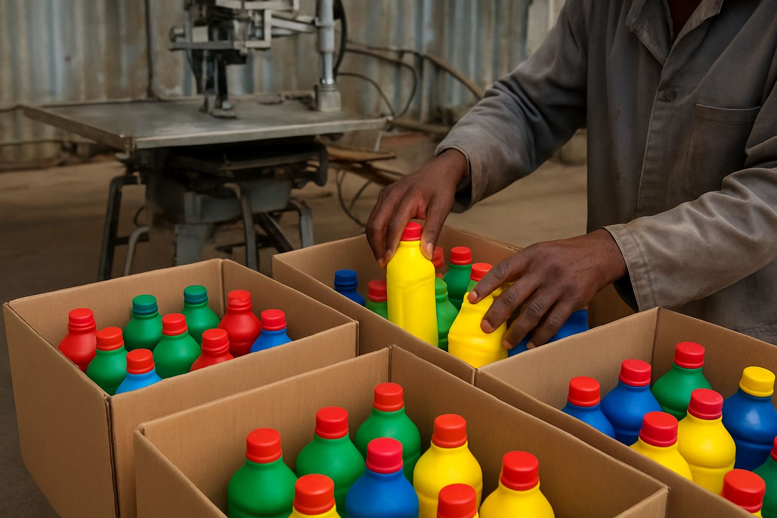
The client was a small-to-mid sized household cleaning brand in Soweto working through local retail, cash and carry outlets, and direct supply to distributors in Gauteng. Their bottles were already doing the job on product function, but the pack was getting lost next to brighter competing lines. The brief was straight forward: make the bottle easier to spot, keep the finish neat on a curved surface, and do it in a way that could hold up through handling, transport and damp storage areas. They wanted strong graphics with clear product names, a bold block of colour, and enough detail to help the brand look established without pushing the bottle price too high.
The pack had to work on plastic bottles that varied slightly in wall thickness, so print consistency mattered. The client also wanted a process that could run locally with minimal downtime, because delays on a wash and cleaning range can affect store replenishment very quickly. We kept the solution practical and set it up around what the line could carry day to day, not an idealised lab condition.
Bottle Specs And Print Constraints
The bottles were cylindrical household cleaner containers in the 250 ml to 1 litre range, with a few sample runs on 500 ml packs. The main challenge was the curve and the surface finish. Some bottles had a slight gloss that could cause ink movement if the screen tension or squeegee pressure was off. Others had a more matte feel, which held the print well but still needed careful alignment for repeatability. The product would be used in homes, backyard wash areas and small business cleaning cupboards, so the print had to stay legible after hand contact and moisture exposure.
- Cylindrical plastic bottles in 250 ml, 500 ml and 1 litre sizes
- Bold two to three colour graphic layout with strong product naming
- Print area set for front panel visibility at retail distance
- Ink choice matched for adhesion on prepped plastic surfaces
- Artwork positioned to allow clear barcode and batch marking space
We also allowed for seasonal load shedding in the scheduling. That meant planning setup, curing and sample checking in a way that did not leave half a batch waiting if power dipped mid shift. On this kind of job, small interruptions can throw off colour matching and slow the whole run.
What We Supplied And Set Up
We supplied the cylindrical screen-printing equipment, the matched screens, and the supporting setup for bottle handling and registration. The job needed a format that could manage a repeatable wrap on round containers without scuffing the body or shifting the print. Our team prepared the screens for the client artwork, set the print positions, and helped test the run on sample bottles before full production started. Screen making and screen reclaiming were included in the support plan so the client could reuse and maintain the print tools properly between repeat orders.
For the first run, we also checked colour setup and drying behaviour to make sure the finish stayed even under normal production pace. The result was a cleaner handover for the operator team, less wasted stock, and a much smoother changeover between sizes. It is the kind of preparation that saves time later, especially when the same bottles may be used for different cleaning formulations in the same month.
- Cylindrical screen-printing machine matched to bottle format
- Custom screens prepared for the artwork and size range
- Operator guidance on loading, alignment and print checks
- Colour setup support for consistent batch-to-batch output
- Screen reclaiming process explained for reuse and upkeep
Installation And Training In Soweto
The install and first training cycle took one week on site, with the project moving from setup to usable production in a short, controlled sequence. We worked through machine positioning, power checks, print alignment and basic maintenance routines. The client space was practical and tight, so we made sure the machine flow suited the available room and did not force the team into awkward movements during the print cycle. That matters more than people think because a bottle line is only as steady as the operator movement around it.
Farieda handled production training with the team, while Anele worked through installation and print trials. The client staff picked up the key steps quickly, especially around screen handling and keeping the bottles consistent before print. We left them with a simple operating routine and a maintenance checklist they could follow daily. It was not a complex system, but it had to be dependable, and that was the main point.
- Install and setup completed in 1 week
- Operator training covered loading, print pressure and inspection
- Basic maintenance checklist issued for daily use
- Trial prints checked before release to production
Results On The Finished Bottles
The new print gave the cleaning range stronger shelf presence straight away. The darker blocks and cleaner logo placement made the bottle easier to spot from a distance, which helped on crowded retail shelves and in distributor displays. The graphics looked sharper, and the print sat better on the curved container than the client had been getting before. The bottles now looked more consistent across sizes, which supported a more settled brand image and reduced the uneven look that can happen when a pack is printed in bits and pieces.
From a production angle, the improved registration reduced rejects, and the client reported fewer bottle issues during packing because the prints were drying more evenly. That meant less handling damage and a cleaner finish by the time stock left the site. For a cleaning product, that sort of detail counts because the pack has to look ready for use, not just printed for the sake of it.
What We Would Repeat On The Next Run
If we were doing the same job again, we would keep the same core setup but allow a little more time for colour matching on the first sample set. The artwork itself worked well, yet on round bottles a small change in ink load can change how bold the product name reads under store lighting. We would also keep the same attention on bottle handling, because a clean bottle surface and steady feed made a clear difference to print quality. Once that was sorted, the run moved well.
For this sort of household cleaner job, our preferred approach is always the same: print a practical design, train the team properly, and leave the client with a machine setup they can use without calling for help every day. That is what gives a bottle range staying power in the market, especially when stock needs to move through Johannesburg, Pretoria and the wider Gauteng trade route without drama.
Key facts
| Project | Soweto Cleaner Bottles |
|---|---|
| Client type | Household cleaning product producer |
| Town | Soweto, Gauteng |
| Bottle sizes | 250 ml, 500 ml, 1 litre |
| Timeline | 1 week install and training, then production run support |
| Supplied | Cylindrical print machine, screens, setup, training and maintenance guidance |