Why round surfaces change the artwork brief
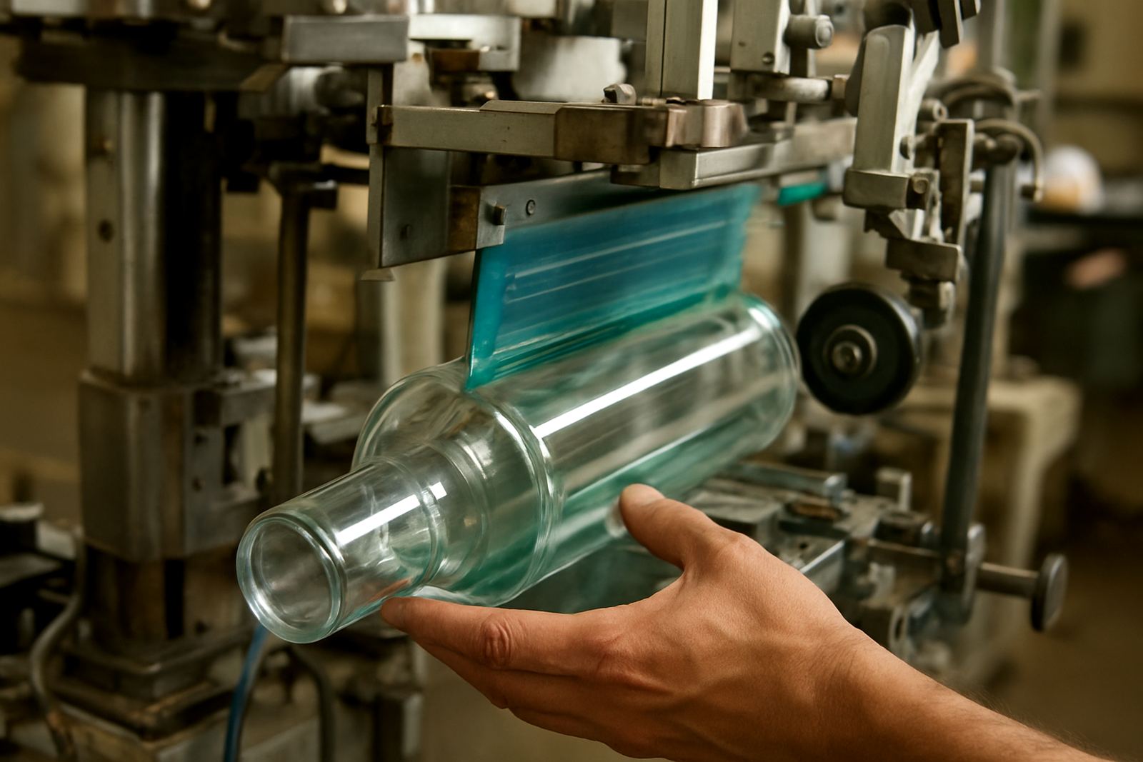
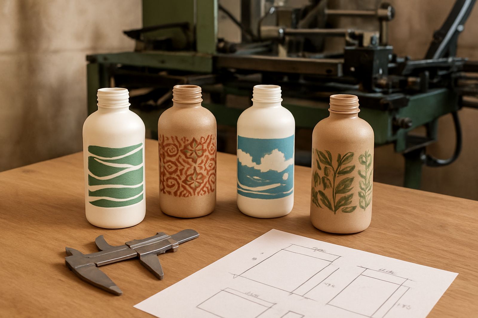
A flat layout can look perfect on screen and still fail on a bottle. On cylindrical products, the graphic moves around the curve, so what sits in the centre on paper may shift once it wraps. Text can look too close together, thin lines can disappear and key elements can end up lost near the seam.
That is why artwork for round items needs to start with the product size, not the logo file. The diameter, print area and bottle shape determine how much of the design can be seen at one time. A slim 330 ml bottle, for example, gives a very different result from a wide travel cup or a small cosmetic tube. If the client wants branding that is readable from across a counter in Sandton or at a market in Durban, the design has to be planned with that viewing angle in mind.
For repeat orders, we always advise keeping one master layout with clear measurements. It saves time when a new bottle size or cap colour is introduced, and it helps prevent awkward last minute changes.
Measure the product before you touch the artwork
The most useful artwork information is physical. Measure the exact body width, the usable print height and the straight section where the image will sit. On some containers the surface narrows near the shoulder or base, and that can cut off a design faster than people expect.
- Measure the diameter or circumference, not just the stated bottle size.
- Confirm the full print height from top to bottom.
- Mark the seam or join position if the product has one.
- Check whether the container tapers, bulges or curves sharply.
- Allow for the grip area on cups and the cap thread on tubes.
In Aeroton we often see artwork that was drawn for one sample and then reused on a slightly different batch from a supplier. The print still fits, but the logo lands too low or a line disappears into the curve. A few millimetres can make all the difference, so measuring every batch is worth the time.
Keep the layout readable around the curve
When a graphic wraps, the eye does not read every part at the same distance. The front of the design is seen first, while the side sections roll away as the product turns. For that reason, the most important message should sit in the clearest viewing zone. Brand name, product name or contact details need more space than people usually think.
Thin fonts and fine outlines can work on a flat label, but they may become weak on a glossy bottle or a frosted cup. Solid shapes, slightly bolder lettering and stronger contrast usually print better. Avoid placing tiny copy near the edges, because that is where distortion shows up first.
- Use fewer words and let the shape of the container do the work.
- Keep logos away from the extreme left and right edges.
- Use strong contrast on dark or coloured containers.
- Test small text at actual print size, not only on screen.
If a client wants a full wrap, we normally suggest setting a clear front panel and treating the side areas as supporting space. That makes the artwork easier to read and easier to sell, especially when stock is moving fast through retail or promotional channels.
Think about the seam, overlap and repeat position
On cylindrical products the seam is one of the most important planning points. Even where the print is smooth, the artwork still needs a starting point and an ending point. If a face, word or line lands across that join, the result can look uneven. Good artwork planning places less critical detail near the seam and keeps the main message where it can be seen cleanly.
Repeated artwork also needs a proper repeat length. That matters on tubes and some bottle wraps where the same print may appear several times around the body. If the repeat is off by even a little, the pattern will drift and the finished product looks untidy.
We often tell customers to think of the round item like a moving sign. The front view matters most, but the design must still hold together when the product turns in the hand. That is especially important for retail shelves, hospitality, and promotional giveaways where the item may be picked up often.
Choose artwork that suits the printing method
Different print methods handle round items in different ways. Some jobs need sharper edge control, while others cope better with larger solid areas. Artwork should match the process, not fight it. A design that looks easy to print may still struggle if it uses too many tiny details or very soft gradients.
For cylindrical screen printing, bold blocks of colour and clean edges are usually safer than busy illustrations. If the brief includes photographic detail, very light tints or complicated fades, it is worth simplifying the image before production. That keeps colour registration more predictable and helps maintain a neat finish, even when the workshop is busy or load shedding is disrupting the day.
- Use vector artwork where possible for cleaner edges.
- Reduce very fine reverse text.
- Limit colour count when speed and consistency matter.
- Ask for a print test on the final material if the surface is unusual.
Humidity on the coast, especially in places like Durban, can also affect handling and drying. In those conditions, artwork that is easier to print and easier to cure often gives better day to day results.
Practical artwork checks before production starts
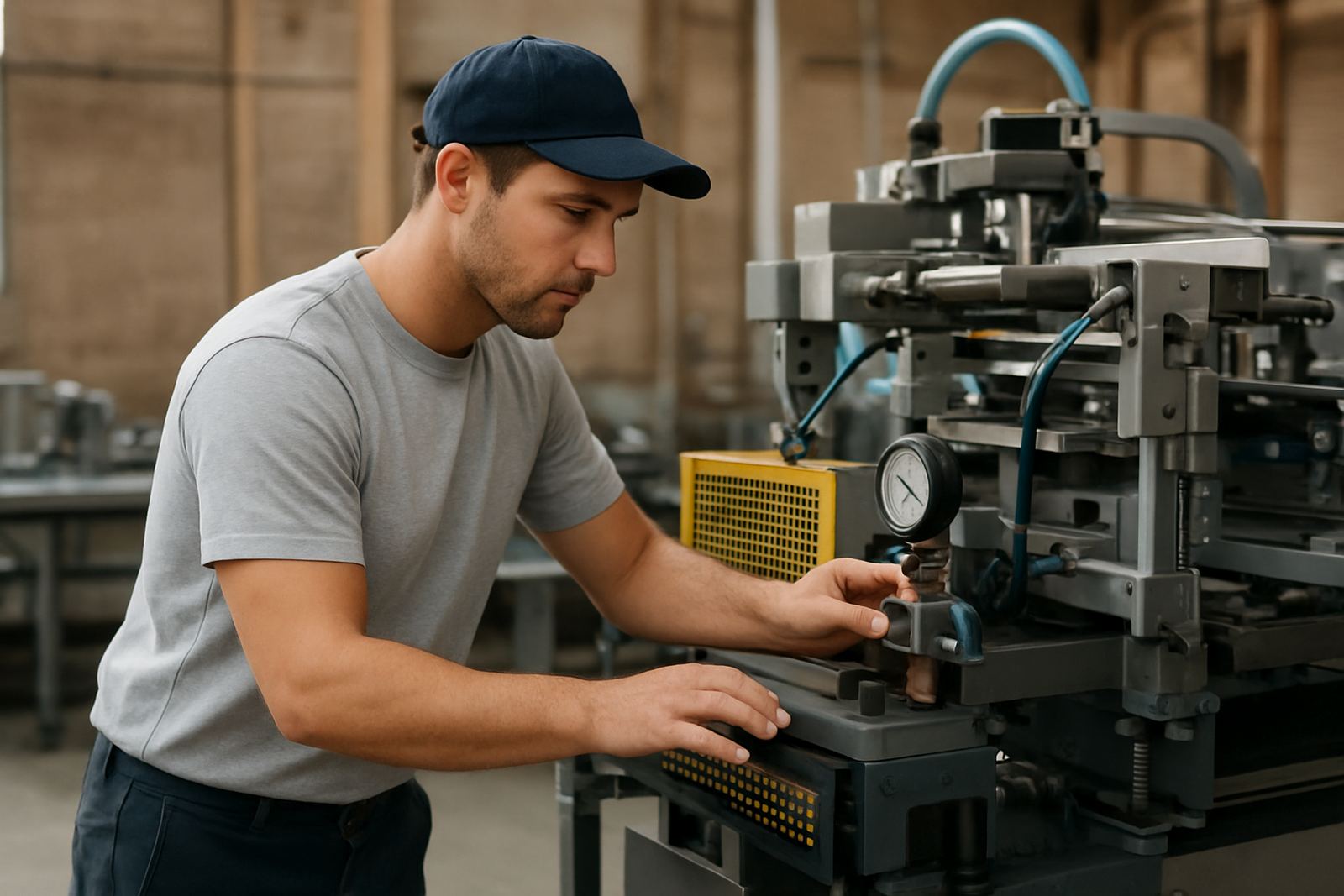
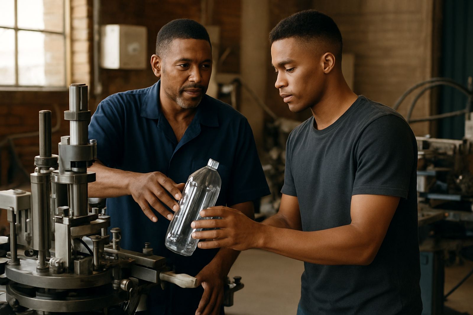
Before any cylinders go into production, it helps to run through a proper check list. This saves rework and keeps a job moving when a client is waiting for stock. At Bottle Screen Printers, the most useful conversations are the simple ones: what is the product, what is the actual size, where does the print sit and how many units are needed?
A local example: a Johannesburg drinks company may want branded bottles for an expo, but the same design also needs to work on sample cups for a tasting table and narrow tubes for a gift pack. The artwork cannot simply be stretched across all three. Each product needs its own set of measurements and, sometimes, its own artwork version. It is a small change but it makes the brand look much more professional.
- Confirm the exact substrate and finish: gloss, matte, clear or coloured.
- Check whether the artwork must face a specific direction.
- Allow for batch variation in bottle diameter.
- Keep approved colour references on file for repeat jobs.
- Plan for spare screens and maintenance if production volumes are high.
When artwork is planned properly, the print line runs smoother, the colours stay cleaner and the final product is easier to handle by packers, retailers and customers alike. That is the difference between a print that merely fits and one that supports the brand.