What mesh count actually changes on a bottle or tube
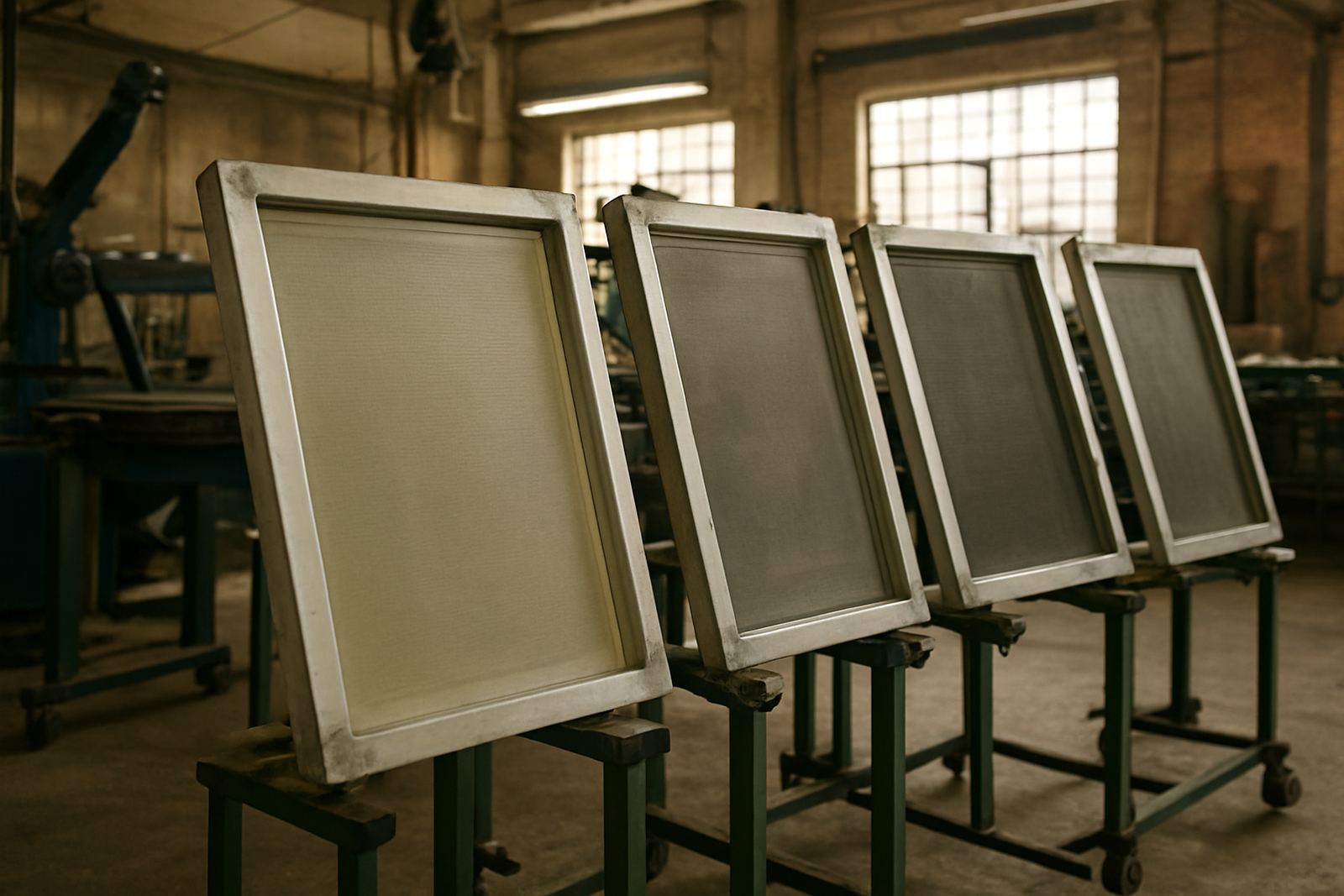
Mesh count refers to how many threads are woven into each centimetre of the screen. A lower mesh has larger openings and lets more ink through, while a higher mesh holds back more ink and gives finer detail. On cylindrical work, that choice affects far more than just appearance. It changes how well the print wraps around the curve, how quickly the ink levels out, and whether fine text stays sharp at the seam.
For a straight sided container you can sometimes get away with a mesh that is slightly off. On a curved bottle or slim tube, there is less room for error because the squeegee pressure and screen contact shift across the full circumference. If the mesh is too open, the print can flood, blur or feel heavy. If it is too fine, the ink may look starved and patchy, especially on darker substrates or where the surface has a slight mould line.
That is why mesh selection is part of the setup, not an afterthought. It should be matched to the ink type, artwork, substrate and the kind of output you need from the job, whether that is bold branding on a 500 ml water bottle or fine batch coding on a tube.
Start with the artwork, not the screen stock
The first mistake is choosing mesh from what is on the shelf instead of what the artwork needs. A simple logo with solid blocks can handle a lower mesh count because the print area needs enough ink to stay even. Small lettering, fine lines and halftones need a tighter mesh so the detail stays clean. If you force a detailed job through the wrong screen, the edges soften and the customer notices it straight away.
As a practical guide, ask three questions before you make the screen:
- How fine is the smallest element in the artwork?
- How opaque must the print be on the final product?
- Is the substrate smooth, glossy, textured or slightly flexible?
On cylindrical jobs, the product diameter also matters. A narrow tube has a tighter print path than a wide bottle body, so the same artwork can behave differently from one item to the next. We often see clients in Johannesburg and Pretoria running one mesh for a small cosmetic tube and then wondering why the same setup looks too heavy on a sports bottle. The answer is usually in the product shape, not just the ink.
Use ink body and curing method to guide the mesh
Mesh count should work with the ink, not against it. Thicker inks usually need a lower mesh to pass through properly, while thinner inks can support a higher mesh for better detail. If the ink is too thick for the mesh, the printer has to push harder and the print can become uneven across the wrap. If the mesh is too open for the ink, you may get excess deposit that takes longer to dry and can smear during handling.
This becomes important in South African production where load-shedding and stop start schedules can affect drying time. A heavy deposit that would have cured fine in a steady line may become a problem if the product sits longer before curing or packing. In hot inland conditions, the ink can also skin faster on the screen. In coastal areas like Durban and Cape Town, humidity can slow down drying and make an over-heavy print feel tacky for too long.
Screen printers should test the full cycle, from print to cure to rub resistance. A mesh that looks good wet but fails after curing is not the right choice. Check the finish under normal handling conditions, not only under workshop lights.
Cylindrical coverage needs even tension and the right opening
Printing on a cylinder is about keeping the ink deposit consistent as the screen travels around the curved surface. Mesh with poor tension or the wrong opening can leave lighter bands at the edges, especially on larger wrap areas. The closer the product comes to a full 360 degree print, the more important it becomes to balance deposit with registration.
For bottles and cups, a medium mesh is often the safest place to start for general branding because it gives a practical mix of detail and ink flow. For bold opaque graphics, a slightly lower mesh may be needed. For fine decoration or small text, a higher mesh can help keep the lines crisp. Tube printing can be trickier because the wall may flex a little under pressure, so the screen must release cleanly without flooding the image.
- Use lower mesh for solid spot colours and heavier ink deposits.
- Use medium mesh for general bottle branding and mixed artwork.
- Use higher mesh for fine text, small logos and detailed marks.
There is no single number that suits every job. The best result comes from matching the screen to the product and not forcing one setup to carry everything.
A Johannesburg example: one design, two different results
A customer in Aeroton brought in two products for the same campaign, a wide plastic bottle and a slim metal tube. The artwork was identical, with a bold logo and a small line of product detail underneath. On the bottle, a lower mesh gave good coverage but the small line looked soft. On the tube, that same mesh laid down too much ink and the curve made the logo heavier on one side. We changed the screen spec and adjusted the setup for each item instead of trying to use one approach for both.
The result was cleaner text on the tube and better coverage on the bottle, with less rework on the press. That is often the difference between a job that just prints and a job that ships on time. For local factories working under tight schedules in Johannesburg South, Midrand or Pretoria, that saves hours across a week. It also reduces waste, which matters when you are holding stock against a contract and can not afford repeated test pulls.
Good mesh choice is not about making the print fancy. It is about getting the right amount of ink onto the right shape, first time.
When to review mesh selection on an existing production line
Even if a line has been running for years, mesh count should be reviewed when any part of the job changes. New ink chemistry, a different bottle supplier, a revised logo or a shift from matte to gloss can all affect how the screen behaves. If customers start complaining about light print, poor curing or uneven wrap, the screen may be part of the problem.
- Review mesh when artwork becomes more detailed.
- Review mesh when moving from glass to plastic or coated metal.
- Review mesh when production speed or curing conditions change.
- Review mesh if you are seeing ghosting, excess build-up or weak opacity.
Maintenance matters too. A screen that was right when new can perform differently after repeated use if tension drops or the mesh is not reclaimed properly. That is why screen reclaiming, preventive maintenance and operator training all sit alongside mesh selection. The screen is only one part of the system but it carries a lot of the result.
Choose mesh as part of the full print setup
Mesh count should be selected with the full production picture in mind: artwork, ink, substrate, curing and the shape of the product. On cylindrical work, small changes in any one of those can shift the result from clean and sharp to heavy and patchy. The safest approach is to test properly, keep notes on what works and treat each product family on its own terms.
For bottle, cup and tube printers, that habit pays off. It gives more consistent colour, better coverage around the wrap and fewer rejects at the end of the day. If you are setting up a new line or trying to sort a recurring print problem, the mesh may be the first thing to check.
One right screen choice can save a lot of ink and even more time.